Skip to content
HomeVideos
AllLongsCategoriesPlaylists
BooksBlogsPodcasts
HistoryListsWatch laterLiked videosFollowing

The videos, books, blogs and podcasts Hacker News keeps recommending, all in one place.

VideosBooksBlogsPodcastsAboutPrivacySettings

Data from Hacker News, HackerTube, HackerBooks, HackerBlogs and Open Library. Credits · Not affiliated with Y Combinator.

HomeVideosBooksBlogsPodcasts
Ctrl K

    The User is Drunk

    squareweave

    4 HN recommenders · recommended in 3 months, 2014–2021

    YouTube

    4:23 · 275K views · Jan 16, 2013

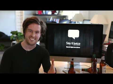
    A short talk by Will Dayble of Squareweave arguing that you should design software as if the user were drunk: distracted, impaired in attention and vision, and prone to misreading. It is a user experience talk built around that framing.

    HN users recommend it as a memorable, short way to build empathy for users' confusing mistakes and to design for distraction.

    Design, Graphics & Visual MediaUX & UI design
    1. 21:35
      Music Software & Bad Interface Design: Avid’s SibeliusTantacrul1.7M views • 7 years ago
    2. 1:44:09
      Jonathan Blow: Video Games and the Human Conditionrubbermuck158K views • 15 years ago
    3. 49:57
      Meaningful Play: Getting Gamification RightGoogle TechTalks118K views • 15 years ago
    4. 43:30
      Are we stuck with the same Desktop UX forever? | Ubuntu Summit 25.10Canonical Ubuntu510K views • 10 months ago
    5. 20:38
      What Games Are Like For Someone Who Doesn't Play GamesRazbuten17M views • 7 years ago
    6. 18:15
      So... the minute hand shows progression — apparently we think of time in wildly different waysTechnology Connextras706K views • 4 years ago
    7. 23:41
      Windows 8: The Animated Evaluationblogphilofilms645K views • 13 years ago
    8. 48:39
      Andrew Price - Improving Blender's UIBlender62K views • 13 years ago
    9. 54:20
      Bret Victor - Inventing on PrincipleRui Oliveira339K views • 14 years ago
    10. 33:39
      Music Software & Interface Design: MuseScoreTantacrul960K views • 7 years ago
    11. 27:36
      Why Western Designs Fail in Developing CountriesDesign Theory1.8M views • 2 years ago
    12. 1:04:47
      Don't Make Me ClickGoogle TechTalks73K views • 18 years ago
    13. 46:33
      How We Made MuseScore 4 - Music App Design is Challenging!Tantacrul814K views • 3 years ago
    14. 15:38
      Juice it or lose it - a talk by Martin Jonasson & Petri Purhograpefrukt616K views • 14 years ago
    15. 1:17:21
      The GUI should be better. A lot better.Accursed Farms397K views • 6 years ago
    16. 3:23
      Applied Sciences Group: High Performance TouchMicrosoft Research1.4M views • 14 years ago
    17. 1:16:21
      Notation Must Die: The Battle For How We Read MusicTantacrul1.8M views • 3 years ago
    18. 56:22
      Bret Victor - The Humane Representation of ThoughtColin McDonnell58K views • 11 years ago
    19. 48:27
      Jonathan Blow: Game design: the medium is the messageCreativeMornings HQ119K views • 13 years ago
    20. 2:33
      What is a Browser?Ji Lee1.4M views • 17 years ago

    4 comments from Hacker News

    1. @mrtksnJul 2014· in “Show HN: DrunkUserTesting – How does your site perform in the wild?”

      Somebody took "the user is drunk" UI design method quite literally :) Here is a video about the "the user is drunk" idea: this video Basically, the idea is about assuming that your user has an attention and a vision of a drunk person, not designing a UI for literally drunk people. I highly recommend the video.

      Strongly recommendsView on HN
    2. @GeeflowFeb 2021· in “Always Use “Buttons” for Size Selection”

      I wouldn't be much surprised. The amount of things people do _not_ notice is staggering. When I do usability tests there's almost always something that doesn't get noticed although I thought it obvious and/or important. Personal anecdote: I managed to buy paper for my printer and only noticed upon arrival that it was the wrong size. The product photo looked right to be. I did not bother to check the details - or even the product title. ¯\_(ツ)_/¯ Also, regarding "if the person isn't drunk": There's a great short talk called "the user is drunk" which makes one much more sympathetic to such seemingly unexplainable comprehension fails that sometimes drive product designers mad: this video

      RecommendsView on HN
    3. @ignosticJul 2014· in “ Need feedback on Kickstarter landing page”

      -Design quality is good, but you should re-evaluate that top image. Does a tar-covered hand say "High quality leather" to most people? Not to me, especially because I can't see the object. -Headline #1 should tell me what you're doing. Don't assume I know what your deal is about. You could almost switch the first and second. -CTA is way too far below the fold. I should immediately know what you want me to do. Donate? Subscribe? Drop it beneath "You are about to challange [sic] the status quo". -Challenge, not "challange". Might want to look over your page for spelling and grammar... This might be helpful: this video

      RecommendsView on HN
    4. @fireworks10Mar 2015· in “The User Is Drunk”

      "The User is Drunk" is explained better in video by Will Dayble of Squareweave: this video Also, OP's post seems more like "The UX Consultant is Drunk".

      RecommendsView on HN